ORIGINS OF FORM + FIELD
ORIGINS OF FORM + FIELD
Interior design firms are often named after their founders, so I'm sometimes asked about how I came up with “Form + Field” for the name of our company. I thought I'd share the story with all of you.

The logo with the circle representing an object or "form", and the parallelogram representing a plane of space or "field".
I started contemplating about name and branding back when I first started doing interior design part-time on the side. The usual suspects of “Christine Lin Interior Design”, “Christine Lin Studio” didn’t have a great ring to them, nor did they convey the ethos that I wanted the company to have.
My goal from the very beginning has been to build a San Francisco-based company that is more than me and will evolve beyond my lifetime, so I didn’t want my name to define the company. I wanted to create a design collaborative where designers who join the team have say in the direction of the firm and its designs and could become partners. I wanted the name to reflect our holistic approach to design, and eventually extend to represent product lines. The brand had to fit broadly and reflect our modern approach to the industry.
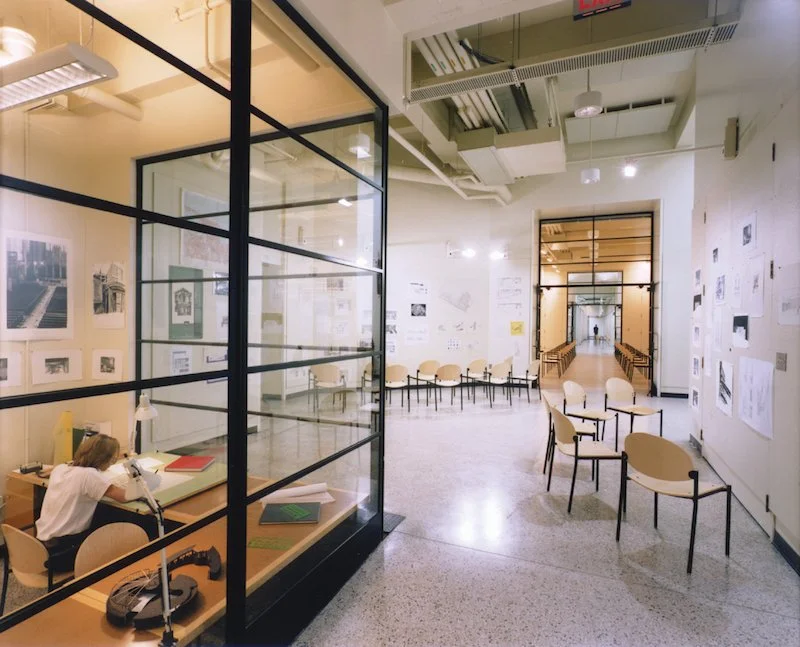
The MIT architecture studios (image credit)
As some of you may know, my educational background is in architecture. It was my first love, and is still one of the biggest sources of inspiration for us. After learning that I was making a career switch from tech back to design, a dear old friend of mine gifted me the book “101 Things I Learned in Architecture School”. It was great timing for a refresher as architecture school was more than 10 years ago! Also, I was still struggling to come up with a great name for the firm.
One night for my daily bedtime reading ritual, I opened up "101 Things I Learned in Architecture School", and when I got to #2 of 101 things, I had the name of my company. #2 states: “A figure is an element or shape placed on a page, canvas, or other background. Ground is the space of the page. A figure is also called object, form, element, or positive shape. Ground is alternatively called space, residual space, white space, or field.”
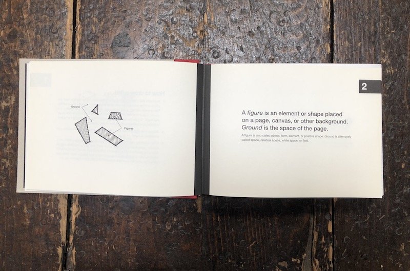
#2 from the book "101 Things I Learned in Architecture School"
I immediately knew I wanted to use these two elements in the company name because it describes not only the objects (e.g. furnishings, art) that populate a space, but the space itself (e.g. walls, planes). The combination spoke to our holistic process as designers in which we consider the context and setting in selecting the objects that go within. Not to mention, alliteration always sounds good! Thus, “Form + Field” was born, and it still feels like a perfect fit today.