

SELECTING COLORS | FOR INTERIORS
For the final post in our Impact of Color Series, we’re putting all of the knowledge from our previous posts into practice. This is the moment when color preferences need to be taken into consideration with light sources, space opening techniques, and the particular space in question.

THE CHANGING HUES | OF MODERN DESIGN
For our fifth post in The Impact of Color Series, we’re going to talk about how color is used in modern design. Keep reading to explore color use over the history of Modernism.

GREEN, BLUE, + VIOLET
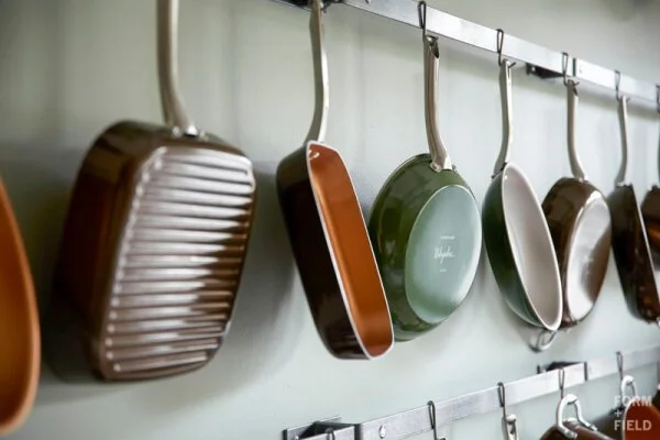
For our fourth post in The Impact of Color Series, we’re moving on to the final three colors in the visual spectrum: green, blue, and violet. Like red, orange, and yellow, these last three colors might surprise you with the contradicting emotions they inspire.
But most important is how they inspire you. Come take a look...

RED, ORANGE, + YELLOW
For the third post in our Impact of Color Series, we’re going to dive into three of the most controversial and contradictory colors: red, orange, and yellow. We’ll share these colors’ history, how they’re perceived today, and an example of each in interior design.

BLACK, WHITE, + GRAY
For the second post in The Impact of Color Series, we’re going to dive into black, white, + gray, or what are commonly known as neutrals. In interiors, you might see beiges and nudes listed as neutrals, but these are technically “tints,” colors that have white added to them.
True neutrals are defined as white, black, and the full spectrum of grays in between. Keep reading for more about all three.
THE IMPACT OF COLOR SERIES / INTRODUCTION
Our newest series is dedicated to a topic that affects every aspect of our daily lives - COLOR. Over the next several months, we’re going to talk about the history of color, the way we perceive color, how it affects us, and how it influences our interiors.