
THE IMPACT OF COLOR SERIES / INTRODUCTION
THE IMPACT OF COLOR SERIES / INTRODUCTION
Our newest series is dedicated to a topic that affects every aspect of our daily lives - COLOR. Over the next several months, we’re going to talk about the history of color, the way we perceive color, how it affects us, and how it influences our interiors.
WHAT IS COLOR?
Color is an illusion. That’s right — our physical world does not actually consist of the colors our eyes perceive.
Instead, visible light waves bounce off the surface of an object, reach the photoreceptors in our eyes, and our brains interpret those signals as color. Animals with different photoreceptors can receive the same wavelengths and see a color that’s entirely different, or not see a color at all. Bees, for example, can’t see red.
Another layer of the color illusion is the way our brains process color. The human brain receives an exact replica of what the eyes are seeing, but it then reconstructs this sensory information by giving the image meaning and context that make sense to us.
Considering we all have unique life experiences, what makes “sense” to each of us is unique too. We could essentially look at the same scene and see two different ones.

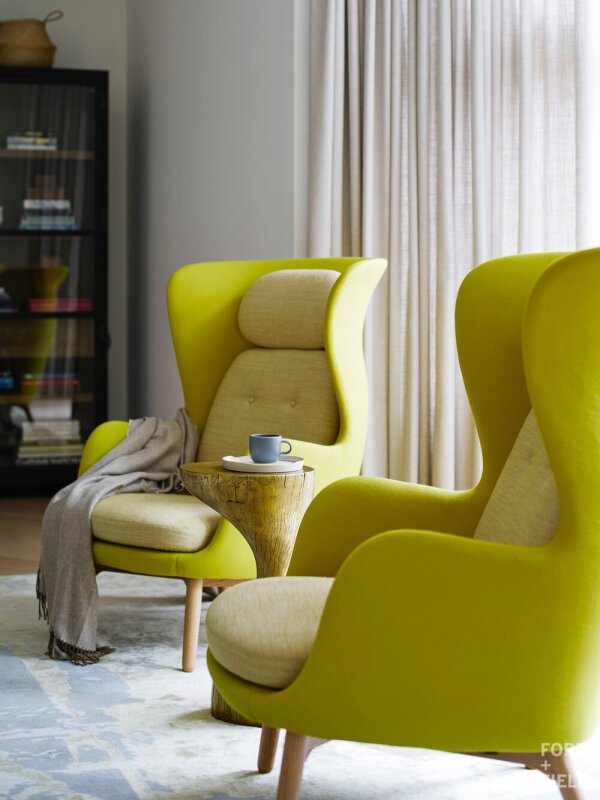
This is the color we would call chartreuse. What would you call it?
CULTURAL CONDITIONING TO COLOR
Much of what we believe about color isn’t rooted in fact or science. It’s cultural. We spend our days surrounded by color in myriad contexts, from the colors we believe are appropriate to paint our interiors, to traffic lights, to the branding on the products we buy.
Imagine another person on the other side of the world surrounded by an entirely different set of colors, “rules,” and contexts. How might they see the colors of the world differently from you?
Black and white are two great examples of cultural conditioning. In Western culture, white is perceived as good while black represents evil. But in ancient Egypt, where they lived off of the dark mud of the Nile, black is considered the source of life. In China and Japan, white denotes mourning and is used at funerals.
Your perception of color is nuanced and highly personal, and that context is what we dig into when bringing color into our spaces.

In retail spaces, people are more open to bold color, but why not in residences?
HOW COLOR IMPACTS US
Color has been shown to impact how we feel, but researchers still struggle to differentiate between the source of the emotion. Does the color trigger a physiological response or is it purely psychological conditioning?
At the moment, evidence favors the latter. The idea that red is exciting and blue is calming? Studies have found this to be untrue. (Note that increased saturation is associated with intensity of emotion, not any specific color itself.) The idea that pink reduces aggression? According to studies, the effect is fleeting.
The good news is that we don’t need evidence to tell us how we should feel when we see certain colors. We feel how we feel. It’s left to each of us to identify the emotions that certain colors induce and decide if and how we want to incorporate them into our lives.
This is where interior design comes in.
Subtly brown-tinted green felt naturally soothing for our Lake District project.
THE FLUIDITY OF COLOR
Color is ever-changing based on its surroundings. We could take that chartreuse wingback chair from a white room, put it in a navy-hued room, and our eyes would see it in a whole new way. How we see color is dependent on what color is next to it.
The same can be said for light. We can use darker colors to help walls recede and make poorly lit spaces look larger. We can use lighter colors to reflect natural light and create visual spaciousness. But the actual color we perceive in a space is fluid, because the light source changes. Depending on which direction the light is coming from, the quality of the light will also change and affect the color.
From dawn to dusk, summer to winter, north to south, east to west, the cast of natural light changes constantly. When the sun goes down and our artificial lights are turned on, our interiors experience another shift in color perception.
In other words, we are unlikely to see any color’s “true hue” at all times, though by now we know that a “true hue” doesn’t exist.
Instead, we get to enjoy the infinitely nuanced hues at play in our spaces — and all the emotions and feelings that come with it. That is the beauty of color!
