
BLACK, WHITE, + GRAY
BLACK, WHITE, + GRAY
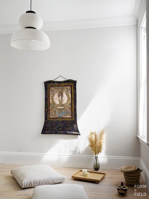
For the second post in The Impact of Color Series, we’re going to dive into black, white, + gray, or what are commonly known as neutrals. In interiors, you might see beiges and nudes listed as neutrals, but these are technically “tints,” colors that have white added to them.
True neutrals are defined as white, black, and the full spectrum of grays in between. Keep reading for more about all three.
BLACK
By definition, black is the negation of light and color. Surfaces appear black when they absorb all visible light waves.
In Western culture, black has always stood for evil (and white for good). The evolution of the English language now uses “black” in negative words like blacklist, blackmail, and black sheep. Filmmakers are famous for using darkness to represent the unknown, add danger, or create an evil character.
Fortunately, when it comes to interiors, black doesn’t need to carry these negative connotations. In fact, it’s fascinating to work with. Depending on the space, black’s ability to absorb light can make walls recede and rooms look larger. It can be used to ground elements in a space or create gorgeous, elegant contrast.
Whether you like black or not, I bet you’ll be hard put to find a space without it!

WHITE
White is the opposite of black, both in perception and in the sense that white surfaces reflect all the colored lightwaves in the spectrum. We associate white with freshly fallen snow, moonlight, doves, white flags, and the medical profession.
It’s no surprise then that white has mostly positive connotations: innocence, coolness, lightness, cleanliness, refinement, and peace.
In interiors, white is well known for its ability to reflect sunlight and artificial lighting. It has become the best-selling paint and garnered a more recent widespread reputation for making interiors feel larger. Be wary though: small, poorly lit spaces don’t make great candidates for white. If black makes walls recede, white tends to draw them in closer. White walls require great natural light to create that spacious, airy effect.

White cabinets reflect the great natural lighting of this larger, open kitchen in the Mission District.
GRAY
Grays come in a wide range of tones between black and white, and Western interpretations of gray is equally as varied.
In our culture, grays are often associated with cold, impersonal objects like machines, aircraft, technology, concrete, and urban living. But by comparison, gray can also represent the wisdom of age and promote feelings of security.
In interiors, this neutral tone can be used in a variety of applications. It can cool a space down, create depth, and even invite comfort. It all depends on how you use it.

The varying gray shades create depth and comfort in the Fossa headquarters lounge in SOMA
Next up, we’ll be talking about red, orange, and yellow. What’s your favorite color? Would you ever add it to your interiors?
References:
Color: The Secret Influence by Cherie Fehrman and Kenneth Fehrman