
RED, ORANGE, + YELLOW
RED, ORANGE, + YELLOW
For the third post in our Impact of Color Series, we’re going to dive into three of the most controversial and contradictory colors: red, orange, and yellow. We’ll share these colors’ history, how they’re perceived today, and an example of each in interior design.

RED
The human perception of red largely originates from blood and fire. In fact, the Chinese word for “blood red” is older than the word for red. The planet Mars, named for the Roman god of war, is called the red planet.
As blood and fire represent both life and death, true reds (such as scarlet, vermillion) are similarly associated with a series of contradictions: love and lust, courage and violence, rage and joy. The unifying thread is the intensity and passion behind the emotions.
When mixed with white, red is one of the few colors that change drastically. In stark contrast to charged passion, pink becomes sweet, gentle, and sheltered.
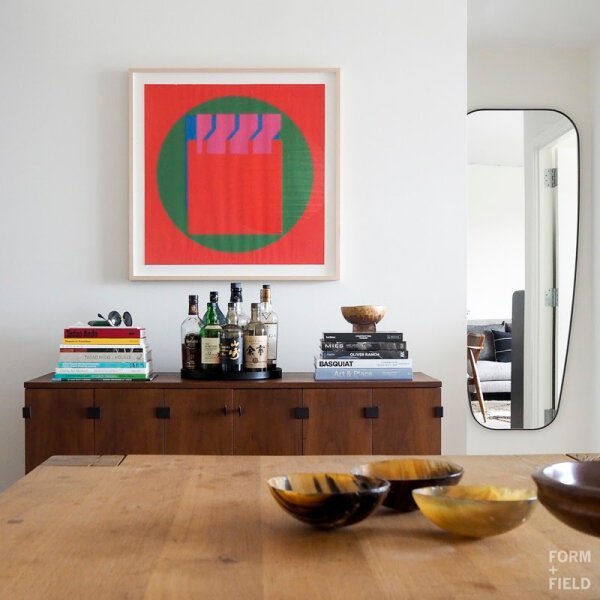
Using red throughout your interiors, like any color, is a highly personal decision. As we mentioned in the first post of our Color Series, our perception of color is based on cultural conditioning, the environment of the color, and the resulting emotions each of us feels.

Pink sets a soft and welcoming tone for this Atherton home’s sitting area.
ORANGE + BROWN
The color orange has similarly fiery origins but is considered warm, not hot. Instead of fire, it is more likely for orange to be reminiscent of autumn’s changing leaves, sunsets, and citrus. By association, most people agree that orange is a warm, cheerful, and extroverted color.
As orange deepens into brown tones, its energy softens into those of comfort and security. Think of the rich, fertile earth that sustains us. Or imagine spices like cinnamon, allspice, nutmeg, and cloves that warm us from the inside and are associated with coziness.

The deep burnt orange hue of the chair feels extra comforting next to the fireplace.
Despite these positive connotations, orange is also famous for its polarizing effects: people seem to either love it or hate it. When it comes to using orange in your interiors, again, you’re the judge!
YELLOW
Yellow is the color most quickly noticed and is often perceived as warm, cheerful, and happy. It’s associated with lemons and citrus fruits, spring-blooming flowers, and the sun. In China, it’s regarded as a special color and, in the 10th Century, was reserved only for the emperor and his imperial order.

A mustard wingback chair punches up warmth and socialness.
And yet… yellow has a darker history, too.
Buddhist monks dyed their robes saffron yellow to remind themselves of their mortality. In medieval times, yellow signified sickness. In 16th Century Spain, yellow was associated with heresy and treason. Not to mention the many poisonous animals that are colored yellow in warning.
In any case, when it comes to interiors, it only matters how the color makes you feel.

The sunny yellow of the tapestry adds brightness and warmth to the living room in our Atherton Estate project.
In the next post our Impact of Color Series, we’ll be discussing green, blue, and violet. Until then, how does your favorite color make you feel? Does it match up with what you’ve read so far?
References:
Color: The Secret Influence by Cherie Fehrman and Kenneth Fehrman