
GREEN, BLUE, + VIOLET
GREEN, BLUE, + VIOLET
For our fourth post in The Impact of Color Series, we’re moving on to the final three colors in the visual spectrum: green, blue, and violet. Like red, orange, and yellow, these last three colors might surprise you with the contradicting emotions they inspire.
But most important is how they inspire you. Come take a look...

GREEN
Green is another color with contrasting interpretations. On one hand, it is associated with growth, spring, and foliage. It was historically worn at weddings in Europe to symbolize fertility and was known in medieval heraldry as the color that represented hope. You may have also seen it in use in the design at spas.
On the other hand, green has been known to represent jealousy, poison, nausea, and decay. The ancient Egyptians expressed this dichotomy well in using the color green to represent Osiris, their god of both vegetation and death.
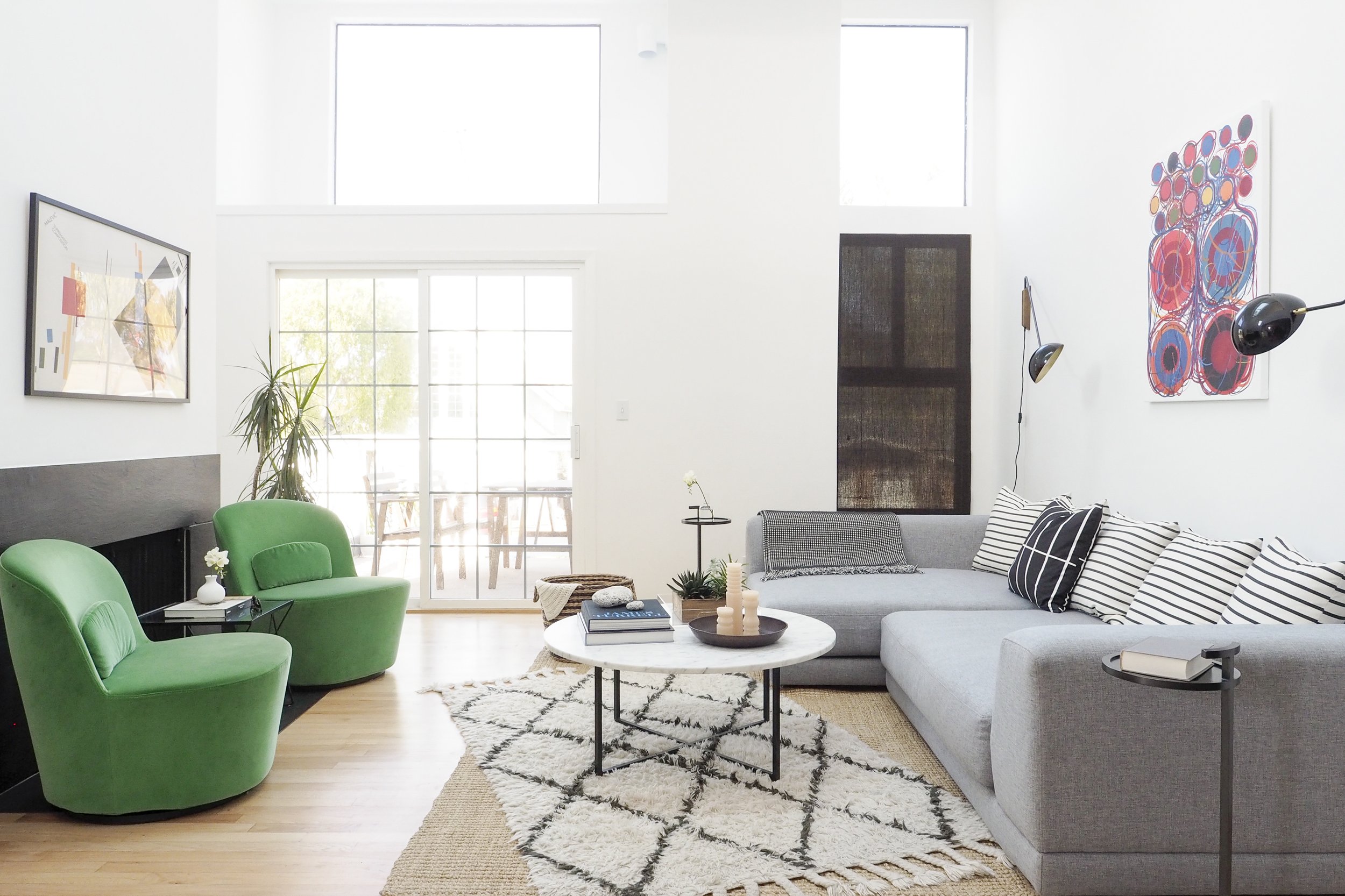
In interiors, green comes in a wide variety of shades and tints. White paint subtly tinted with green or blue is especially common in the U.S. Like all colors, it is largely influenced by whatever is next to it.

The subtly brown-tinted green tile was the perfect shade of relaxing for our Lake Street Modern client.
BLUE
The color blue is most linked to the sea and sky, and by association, serenity and infiniteness. It can also be perceived as the color of transcendence, tranquility, and balance. It’s the most preferred color by Americans, especially men.
As with every color we’ve discussed so far, there are two sides to the perception of blue. By contrast, blue can represent sadness and depression or feel cold and isolating. Blue is also known for being the least appetizing color. (Some say blue dishware reduces one’s appetite.)
In interiors, the color blue is extremely versatile. Varying saturation, tints and shades, and contexts can completely change how the color is perceived and the effect it creates. Here are a few examples:

In our Mission Bay Penthouse project, a rich, saturated blue feels full of energy when complemented with equally saturated yellow, red, and green.

Dark slate blue creates a more serious and sophisticated edge in this modern powder room.
VIOLET
Violet has the shortest wavelength in the light spectrum and the highest energy level (as it moves toward invisible ultraviolet light). Violet is also commonly interchanged with “purple,” but in fact, purple is a mixed color not found in the light spectrum.
Historically, violet and purple hues were so difficult and expensive to manufacture that only the wealthiest could afford them, creating a long-enduring association between purple and royalty. China’s Forbidden City is also called “purple” (though it is mostly yellow and red), and in medieval heraldry purple signified nobility or rank.
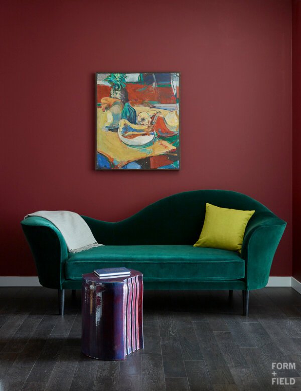
This purple end table inspires interest and a tone of luxury in our client’s Mission Bay Penthouse.
In Western society today, purple is still connected with luxury, decadence, and sensuality. This perception is perhaps aided by the fact that violet and purple are not colors found commonly in nature, and when they are found, they’re expressed in the beauty of flowers or a sumptuous wine.
In interiors, violet and purple are most often seen as accent colors, undertones, or in accessories. But again, color is a personal choice and it’s difficult to generalize too much. If there’s a will, there’s a way.

The rich plum color of the pillow and duvet blend luxury and nature in Ayesha Curry’s Homemade Pop-Up Shop.
In our final two posts, we’ll be sharing more about the use of color in modern design specifically, along with the process we use when selecting colors for interiors.
In the meantime, we’d love to hear which color surprised you the most!
References:
Color: The Secret Influence by Cherie Fehrman and Kenneth Fehrman